Whenever Anthropic release a new model, I have a couple of things I always throw at it before I take any of the launch noise seriously. Mostly it is verification work. I point the new model at projects I already have running, the trading system chief among them, and ask it to look for something I have missed. The idea is to see existing work in a different light, and to find out whether there is a deeper truth in all that data that the current setup has not surfaced. It is also just a good test, because I know these systems well enough to tell straight away whether an answer is real or whether the model is just being confident.
So that is where Fable 5 started for me. Not with the music video, which I will come to, but with the boring stuff.
The tests I always run
I threw it at a few things. The trading system, because it has the most data behind it and the most of my own assumptions baked into it. Some deep games design research, and a plan I was about to trigger.
The honest result is that it came back with interesting observations, but they were mostly about sequencing rather than any great revelation. It did not find a buried truth in the trading data. What it did do, on the games plan, was suggest a better order to do things in, and it was right. Not dramatically, just a clean, sensible improvement, the sort a good colleague offers when they read your plan over your shoulder.
That is genuinely useful. It is not a paradigm shift. If I had stopped there, this article would have been short: Fable is a refinement, file under incremental, move on. If anything I felt the step from Opus 4.7 to 4.8 more clearly than this one, and in a very specific way. Fewer assumptions. 4.8 stopped quietly filling gaps with its own guesses and started either asking or flagging them instead. That was a real, clear improvement. Next to it, Fable on these analytical tasks felt like more of the same, done a little more smoothly.
And then I gave it a song.
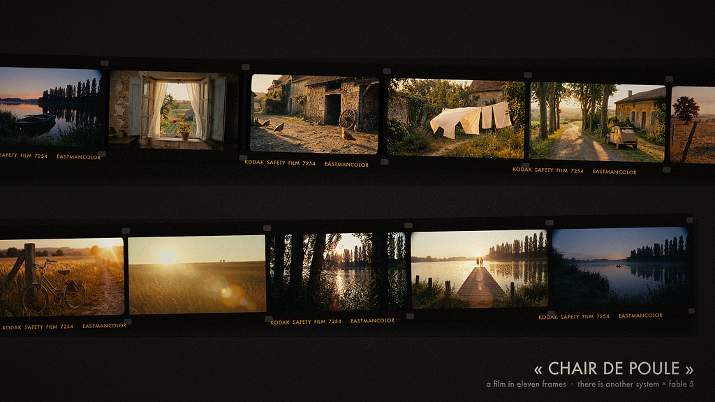
Chair de Poule
The track is called Chair de Poule. A one minute forty ambient piece I made as There Is Another System, no beat, all texture. The brief I gave Fable was deliberately about feel rather than instruction: Boards of Canada, 1960s and 70s French cinema, old public-broadcast film, an authentic worn quality, a dream state. And one constraint that turned out to matter more than I realised. It should not feel like a loop. It should have a beginning, a middle and an end.
Listen before you look
The first thing it did was not make images. It suggested analysing the track first, and ran a librosa pass over the WAV to find the structure the edit could hang on. It mapped the piece into sections: a near-silent fade-in, a warm dark body, a bright climax peaking around seventy-five to eighty seconds in, close to the golden ratio of the track, a quick decay, and then a tail of near-silent tape hiss as the recording runs out.
There was no real pulse to cut on, so the edit timing ended up following the energy curve rather than any beat. Every shot boundary in the final film maps to that analysis. The musical peak became the arrival at the destination. And the hiss tail, the bit I had always thought of as dead air, became the ending: the film physically running out of the projector.
I had not asked for that. It listened to my own track more carefully than I had, and handed me an ending I had been sitting on without knowing it.
Five rounds of notes
This is the part I want to be honest about, because it is where the real comparison lives. The first cut was not good. It took five rounds of direction to get to the final film, and the interesting thing is not that it needed five rounds. It is how it took the notes.
The first concept was a summer day remembered, dawn to dusk, with a recurring lake. The stills came back looking like North American suburbia, a bit Stranger Things. My note was blunt: too American, it should be French, farm, countryside. It moved the whole visual world to rural France. Étangs and poplars, stone farmhouses, a 2CV, Charolais cattle, and changed its references from North American archival to ORTF, Rohmer, Varda, faded Eastmancolor.
The second note was the big one, and it is the kind of note I would give a human editor: it feels like a screensaver. That is not a technical instruction. It is a feeling. What came back was three separate diagnoses of why. The crossfades and the perfectly smooth zooms were part of it, because real home movies splice and hard cut, so it removed every dissolve. There was a jitter bug in the fake camera movement, which it traced to a random walk reversing direction too quickly and replaced with a slow sway. And the wear was too clean and too obviously digital, so it built a full 16mm projection emulation over every frame rather than dropping a filter on top.
The third note was about the journey. I said: imagine we are going on a journey from the house to the lake, and the things we would pass along the way. That one sentence became the spine of the film. It dropped the day-cycle structure and rebuilt the whole thing as a walk through a single place at dusk, because, as I had told it, the music has a very dusky feel. The part that struck me is that it did not regenerate the shots I had already approved. It relit them. Keep this exact scene, change the time of day. Nothing I liked was lost.
The fourth round was the title and the ending, down to vetoing a font and cutting an empty-boat shot that was not earning its place.
I am spending time on this because the shape of that loop is the actual finding. The first music video I made with an earlier model took one round of notes and rebuilt itself once, and that was impressive at the time. This was five rounds of direction, much of it about feel rather than function, and each note came back as a specific creative decision rather than a literal reading of what I said. Too clean is not an instruction. It is a complaint. Turning it into a 16mm projection chain is interpretation.
The craft underneath
I will not walk through the whole pipeline, because most of it is engineering and the working notes run long. But a few things are worth pulling out, because they are the difference between a slideshow and a film.
It faked a camera rather than just panning across stills. An OpenCV renderer sampling motion at 18 frames a second and telecining up to 24, because that slight judder is most of what shot-on-film actually means. Handheld sway built from slow sine waves rather than noise, because the noise version had read as jitter and I had said so.
It degraded the footage in post rather than asking the image models for damage, on the principle that prompted damage looks like a filter and signal-path damage looks real. Halation bloom, grain, a faded print grade, dust and hairs and light leaks placed on the act turns, and a two-frame splice flash on every cut, driven by the edit list so the flashes land exactly on the edits.
When video models finally came in, last rather than first, it brought a prompt recipe that is probably the most useful thing in the whole project. For ambient work, you open the prompt with “almost nothing happens”, name only the small motion you want, curtains breathing, water glitter, a tail flick, lock the camera to a tripod, and build the negative prompt as a wall against anything dramatic. The result was one usable take per shot and nothing that looked like an action film.
The whole thing cost about nine dollars in API calls, the abandoned American batch included.
So where does that leave me
I went into this expecting to write that Fable is incremental, and on the tasks I can measure, it is. The trading verification found sequencing, not revelation. The games plan got reordered, not reimagined. Pointed at systems I know well enough to grade, the new model behaved like a slightly smoother version of the last one.
The video work made me less sure, and I think the reason is the interesting bit.
The step up is hard to feel where I can measure it, and easy to feel where I cannot. On the analytical tasks I can effectively mark the model’s homework, and the marks were only a little better than before. On the creative work there is no homework to mark. There is only whether the film is any good, and whether it understood what I meant when I said it felt like a screensaver. That is a judgement, not a number, and that is where the improvement actually shows.
I do not think that is a coincidence. As these models get better, the gains seem to land less in the places that are easy to score and more in the places you can only judge by taste. The remaining distance is not really in raw capability. It is in judgement, in reading what you meant, in turning a vague complaint into a good decision. That is much harder to measure than a benchmark, which is maybe why the hype keeps overshooting and the sceptics keep undershooting at the same time. Both are looking at the scoreboard, and the improvement has quietly moved somewhere the scoreboard does not reach.
So Fable 5 is not a new paradigm. It is also not just another refinement. It is the same remarkable model, improved in a place that does not show up in the numbers, and shows up clearly the moment you ask it to make something and tell it, honestly, that the first cut was not good enough.
The leaps are getting harder to see, partly because the floor is already so high, and partly because what is improving now is the part of the work that was never really on the chart in the first place.
The track, Chair de Poule, was written and produced by There Is Another System. The film was directed over five rounds of notes; the cinematography, edit and engineering were Claude’s. The notes were human. Most of the frames, and all of the code, were not.
The views expressed in this article are my own and do not represent the views of my employer.